What is Graphic Design?
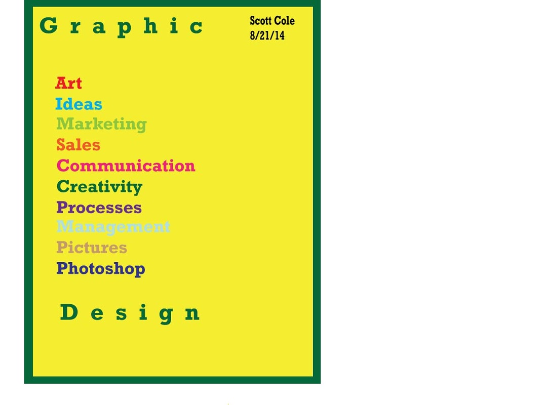
This project had me explain what graphic design is without the help of the internet. I decided to use many colors to define graphic design because it has a lot to do with how different colors work together. I did however, decide to have a lot of green and yellow because this is a project that I did at Casa. I used the rectangle tool for the border because I felt it would be the easiest for me to use. The type tool was used constantly for the words and I incorporated layers with my background image; that was my favorite part of the project.
Elements of Color

For this project we defined the seven elements of art using words instead of words. A big aspect of this project was doing file place to place in pictures for texture and space. I also used the rectangle and line segment tools to create a 3D rectangle which turned out very nice. The heart was put in there for Milton Glaser and that took a lot of work as well. This project was very fun because it took a lot of hard work and I learned a lot of new techniques for different ideas on Adobe Illustrator.
Typography

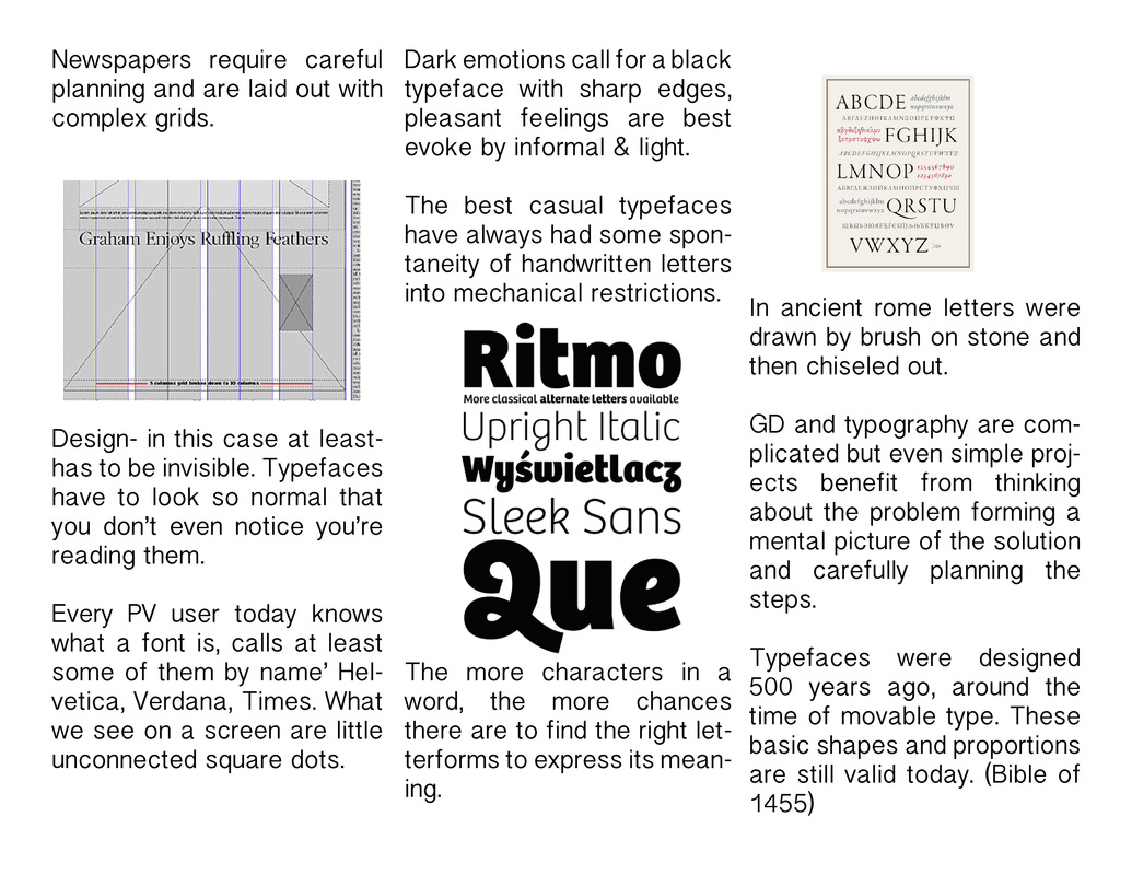
For this project we were asked "What is typography?". We had to show 18 specific words that explain what the different fonts mean. I had the pleasure of working with J.P. on this project and that made the project much easier. We used the type and line segment tools the most often as the line segment tool also helped us create the arrows you see above. Finally learning what Serif means was the highlight of this project for me.
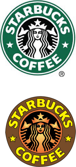
Starbucks Design

My logo

This was the starbucks logo project and it was by far the hardest project of the year. It took all the skills that we have learned this year and had the stress level of some final exams. My logo is not very good as it was hard for me to be very accurate with the pen tool. While there was frustration that came with this project I enjoyed the challenge of creating a known logo and putting my own twist on it. The type on a path tool became very useful for my writing but the pen tool would probably work better if the word "coffee" is any indication. Taking everything into account I would say that this was a fun, but stressful, project.
Landscape Project
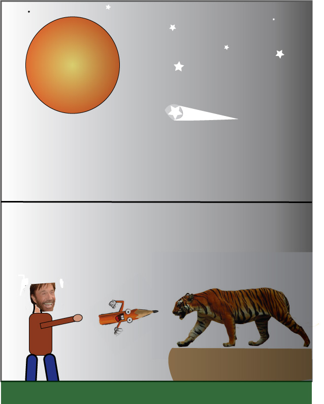
This is my landscape project. It was very hard to do this project because I had to go into Adobe Photoshop so I could change the background for the tiger and Chuck Norris. I used the pen tool for the shooting star and changed the transparency on it so you could still see the star. I used many tools on this project and created many shapes for Chuck Norris' body. I wanted to send a message through my work in a strange way like you see in Picasso and Dali's paintings. That is where I got my inspiration from. I used the white to black background to show the good to evil and the stars to show the landscape in the graphic. Chuck Norris is throwing the pencil at the tiger because he is trying to bring back free speech which has seemed to be taken away from the general public.
Recreated Logos
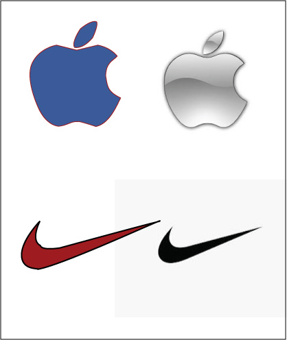
These are the logos I recreated. While they are much more simplistic than the Starbucks logo they are harder than it appears due to their little quirks. They both have many curves and symmetries that you can not mess up. I also changed the color scheme on both for the same reason: identity. In the commercials for Apple they have stuck to traditional black and white. While it gives off a sophisticated look it becomes increasingly forgettable as it is very bland. I think the blue and red will give it a more American identity that can become its trademark for years to come. The Nike logo was also very bland and simple. A red and black color scheme will pop and attract more people to Nike. It will bring in a different target audience as in the casual exerciser; a very important demographic. I used the pen tool exclusively with these logos and it took me very little time compared to the Starbucks logo.
Ad designs with new logos
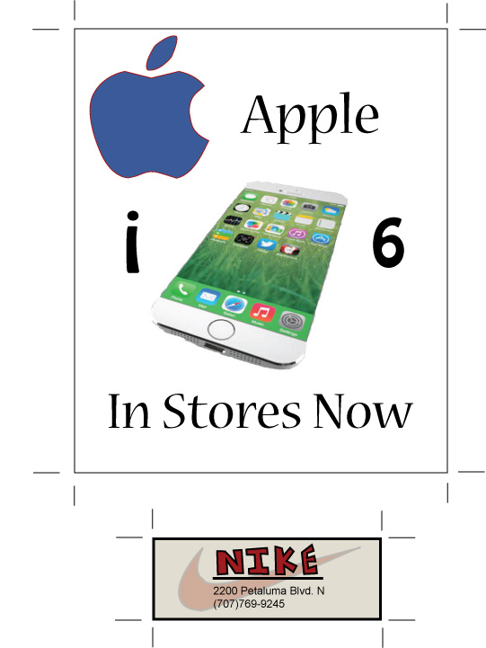
This is my business card and ad poster for my two redesigned logos. I really like my business card because I changed the color scheme to red and black and made the logo behind the text of the card itself. I was able to do this by changing the opacity with the gradient selection. I actually designed the Nike word with the pen tool because I felt like it gave me a more Nike feel that you would see in the store than the fonts we have available to us. I slight change I made that is more difficult to notice at first is that I changed the background of the card. Instead of being white I made a beige color. I thought it made the card that much more memorable. For the ad poster I chose Apple and their new iPhone 6. I went with a white background because I wanted all the attention on the phone itself. I did not include any contact information or store location because this is Apple and everyone knows how to find an Apple store or buy the phone online. For the ad itself, I took some inspiration from Milton Glaser and created a puzzle in the center. There is a different font for the i and the 6 than the rest of the text as well. I thought that this was a fun way of connecting the phone itself to the product they are trying to sell at Apple. The creative control that I got to have for these projects is what made it very fun and simple project.
Starbucks Revisited
Starbucks Logo Revisited
I had a little extra time in class so I decided to retry the Starbucks Logo with a little more flare. My first attempt, which can be seen above, was my first time using the pen tool. I feel like I had gotten much better with the tool so I wanted to see how far I have come. It was much easier this time around and I added my own touches to the logo for fun. I changed the circle to be more simplistic and altered the colors of the classic logo. The Starbucks logo does not need retouching because it is, as stated, a classic. However, I wanted to try some other colors on the logo and see how it turned out. This project was helpful for future projects and furthered my knowledge of the pen tool. I am not sure I would do such a hard project again but it was much easier this time around.
Sartain's Ad Campaign
This is my ad campaign for Sartain's. It consists of a business card, flyer, magazine ad, web banner, and billboard. For each ad design I changed it up based on who was viewing it. For example, on my web banner I only put the website for the contact information because they were already on the computer and you only have limited space to work with. My magazine ad had more bright colors and less information because people just want to flip through the magazine and not stop and read a bunch of information. The bright colors were so it would stand out and readers would stop and look at it for a second. That was my thought process while I was designing these ads and I used a lot of the text tool instead of vector art to make it more professional.
Sartain's Ad Presentation
This is the Prezi presentation I made for my Sartain's Advertising campaign. I only used Prezi a couple times my sophomore year so it was fun to use it again for this project. I did not know everything about Prezi so I had to mess around with it and get the features I wanted on it like the red font. Probably the hardest part about this job however, was saving it as a PDF and uploading it to here. This project was stress-free and fun.
Holiday Fair Flyer
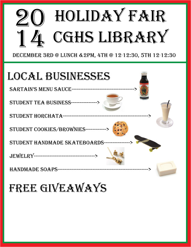
This was my rough draft for the Holiday Fair flyer. I put in a double border so I could get both green and red for the flyer because it reminds me of the holidays. For the final, we might get pictures from the businesses themselves but this will probably be the layout for my holiday fair flyer.
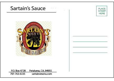
Sartain's Postcard
|
|
|
Front
|
Back
|
Photoshop Project
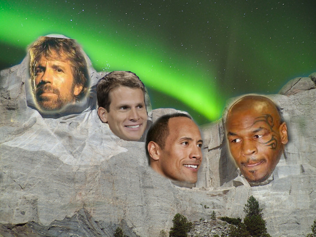
This was our first project where we used Photoshop and not Illustrator. The goal was to put 5 images into one and be very creative. I chose to put Mt. Rushmore with the always pretty Alaskan sky. I put some ultimate tough guys on this with Chuck Norris, Mike Tyson, the Rock, and of course Daniel Tosh. This project was a lot about learning different tools to use when in Photoshop. I am really liking Photoshop right now.
5 in 1 Animal
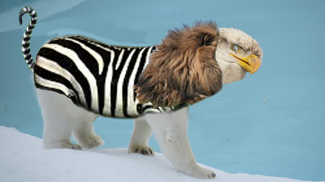
I Photoshopped 5 animals into one. I got bald eagle head, lion mane, zebra body, polar bear legs, with a lemur tail. It was fun to do and used a lot of the eraser tool. I learned the stamp tool and used it to practice but ultimately it did not make my final project. I think I would be pretty scared if I saw this animal out in the wild. Another fun project.
Photoshop Final
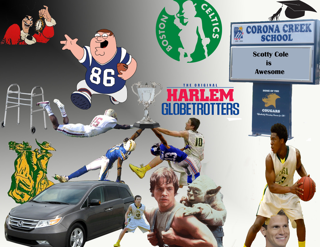
Used proximity with the four players all reaching for the Goblet of Fire trophy. Used alignment with making rows throughout but more specifically with Peter Griffin jumping over the Boston College football player. For the most part I tried to keep my past on the corners and my present and future in the middle. I love watching both college and professional football and I am not a big fan of Harry Potter. I put two things on grid points; The Goblet of Fire trophy and Cetrick's head. I felt that those are the two things that I want people's eyes to flock to and they really stand out.
Post-Modernism Prezi
This is the prezi I made for my final. It is all about Post-Modernism. I always hear about how complicated Post-Modernism and I understand how people can misunderstand it. It is all about being skeptical of culture. It is a very cynical way of thinking but there have been very powerful messages in it.
Pop Art Project
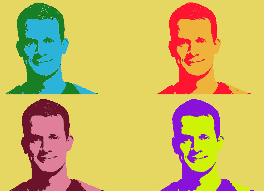
This was my pop art project of comedian Daniel Tosh and it was a fun project to try out my ideas. I stuck to a two color scheme on all of the designs so that there would be some continuity throughout. I used the magic wand and I used the paint bucket. Those were the main tools I used after I changed the pictures threshold. I also looked at the color wheel to see what colors would work well together and used that on the purple picture. This project was fun and I am glad that I was able to do some Pop Art like Andy Warhol.
Every 15 Minutes Shirt
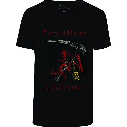
This was my design for the Every 15 minutes shirt. I used Photoshop for almost everything in this project. I changed every color in the design and did that with the paint bucket. I adjusted the photo like the Pop Art project because I thought that would give it a darker sense. This is the first time I really designed something that was as dark as this shirt but it was a nice change of pace. I merged it from image to shirt by erasing the edge of the image with the soft eraser tool. I like how my shirt turned out.
Fixing Old Photos
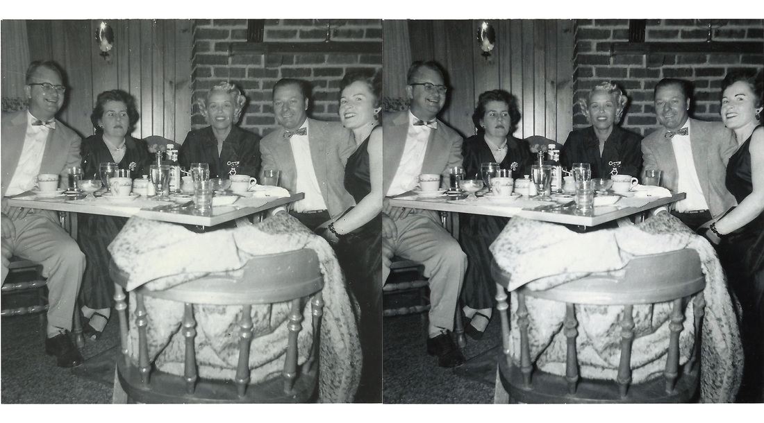
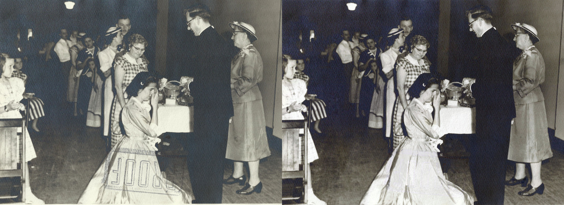
These are the two old photos that I fixed. It was a fun project and we did it all in Photoshop. I used a lot of the Clone Stamp tool and the Spot Healing Brush. They were very helpful in a project like this. I also adjusted the photo using auto-levels and changed the brightness and contrast. My favorite part of the assignment was taking out the "PROOF" stamp on the bottom photo. At first I thought it was going to be very hard but it turned out to be a fun challenge. I hope I get to continue doing this in the future.
|
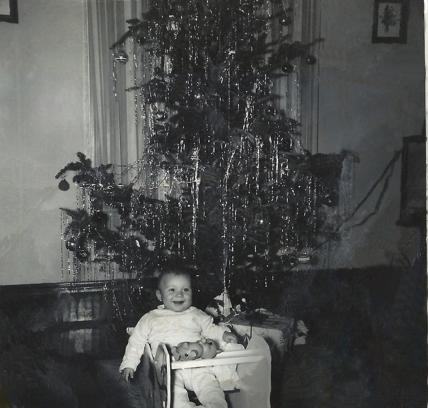
|
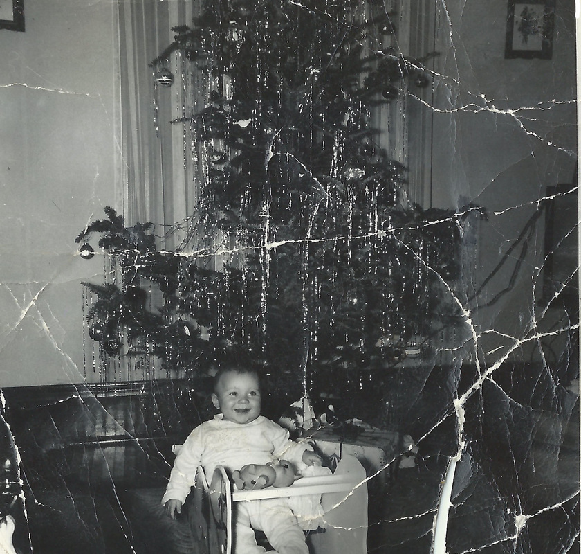
This was the baby and Christmas tree photo, which I think was the most difficult picture of the whole bunch. It was the most damaged photo with a lot of tears and rips but the Christmas tree also had decorations that looked identical to rips. I tried my best on this photo and I think I did a good job. I used the same tool that I used on the other photos and it was just as fun even though it was a lot harder. I can't wait to do some portraits next week.
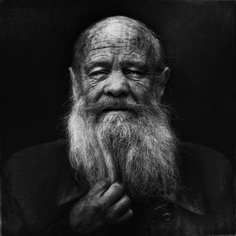
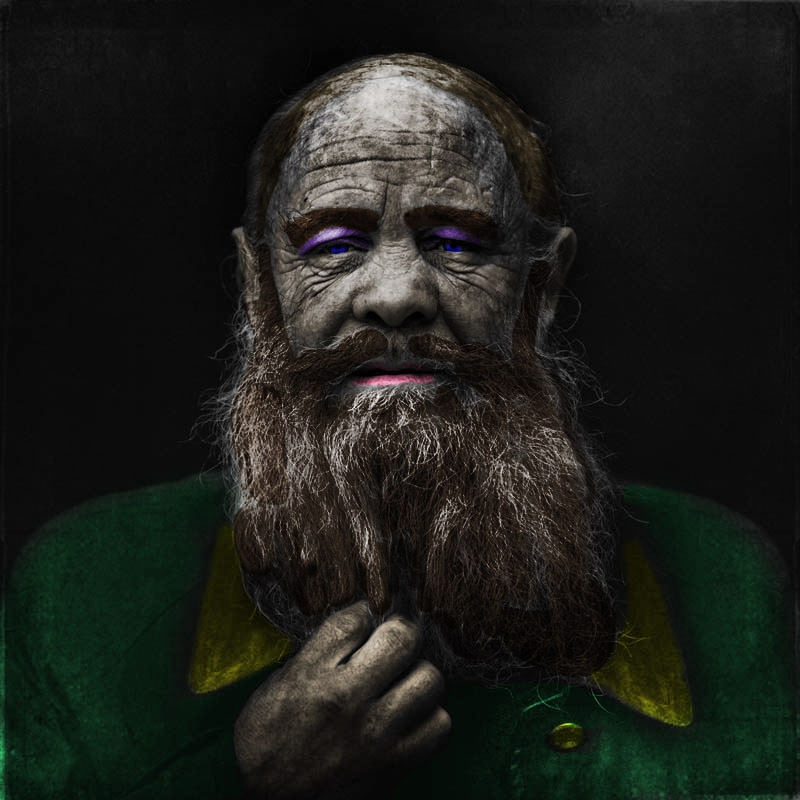
Black and White Portrait
|
|
This was my black and white portrait project where we colored the portraits. It was my first project on the new Macs and it was difficult learning the new stuff like keyboard commands. I used almost exclusively quick mask for this project and I liked it once I got the hang of it. I think this is the first time I used Quick Mask. I thought that this project was fun because we really got to be creative about it. To get the colors like that I changed the layer from normal to overlay. I really like the way it turned out and hope I can do it again.
Half-Animal Project

This is my half animal, half person project. I used a lot of new tools that I had never used before just to try out. I used the sponge tool on the nose/mouth to change the ways the edges look. While it is not exactly what I hoped for it was pretty cool anyway. I tried a new effect on the eyes so that they would provide a little more pop than what the original orange brown demonstrated. I thought this project was fun but pretty difficult on the new Macs. Its tough learning new things on this computer.
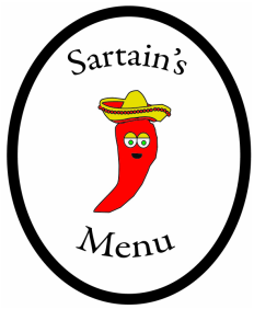
This is my Sartain's Menu logo redone. I tried to get it all vector art but I was having problems with Illustrator. In a real design with more time however, the sombrero and guitar would be vector art using the Pen tool. I used the Pen Tool for basically everything on this design. Along with the Text tool and Ellipse with a heavier stroke.
Redesigned Logo
|
|
These are my logos that are side by side and I wanted to give the logo a mascot so that they could attract a younger audience. This was fun to do and I really wanted to simplify the image because of how complex and complicated the current one is. When you see the new logo, you can tell that it is sauce based on the Chili pepper that is yet to be named. I used the Pen Tool and Type Tool and finally the Ellipse Tool. It was a simple three tool project in Illustrator, than I put color in Photoshop. I like the new logo.
Sartain's Label
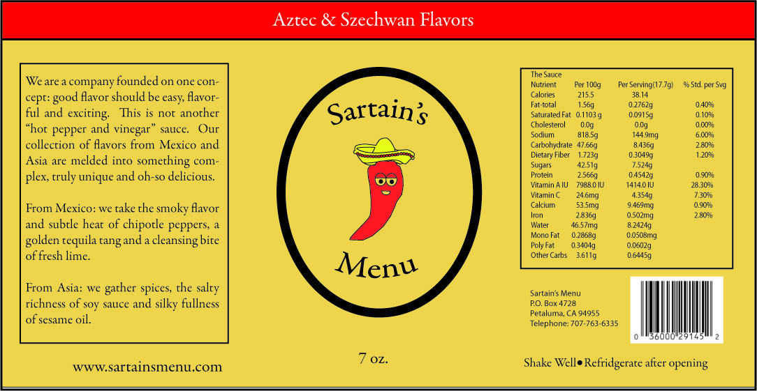
This is my label for the Sartain's Menu. I included my original logo that you can see above. I followed a finished product of the label to create mine. I like it a lot because I got to use the text tool and rectangle tool often and I don't get to use those tools every project. This project became a little difficult to get my background color right but I was able to figure it out after Mr. Meirik helped me out. It was a different experience to create the label.
Sartain's Bottle
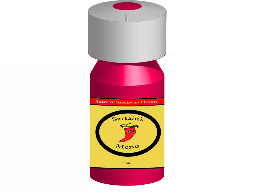
This is my bottle that has my label on the 3D Bottle. This is the final part of the three-part project that we started a couple weeks ago. It was a tough project to fully understand and if you looked at my bottle, I still couldn't get the bottle the way I wanted it. Warping the label just right seemed impossible to me so I left it at the arc you see here. I went into effects, warp, arc; and effect, 3D, rasterize to complete this project. Looking back, I enjoyed this project but it was the second most frustrating project behind the Starbucks project which has been easily the most difficult project this year.
Casa Website Homepage
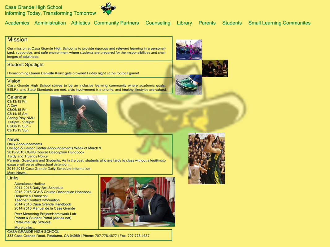
This is my redesigned Casa website. I had a lot of fun doing it and I used a little Illustrator but mostly Photoshop for it. We needed six pictures as well as a school logo. I also put the logo in the background and changed the opacity. Although the yellow background makes it look childish, I liked it a lot more than the alternative colors that I could have chosen. This was fun and I got to put students from around Casa Grande on my designed website, which I think lacks student identity right now. For this we had to use three layers that were nice and clean.
Casa Website Athletics Page

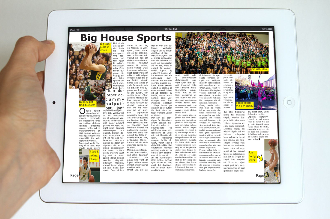
This is my Casa Website Page. It is not my homepage but rather my Athletics Page. I put pictures for the The CG Sixth Man, Big Country, and made Big Jon Christy my watermark background. This project was a lot of fun and we got to use Adobe Illustrator for this one. Hopefully we will get to do more projects like this one because it was very straightforward for the tools that we should use. There was a lot of copy and paste. We still used the three layers for this.
Magazine Design Survey
Big House Magazine Cover
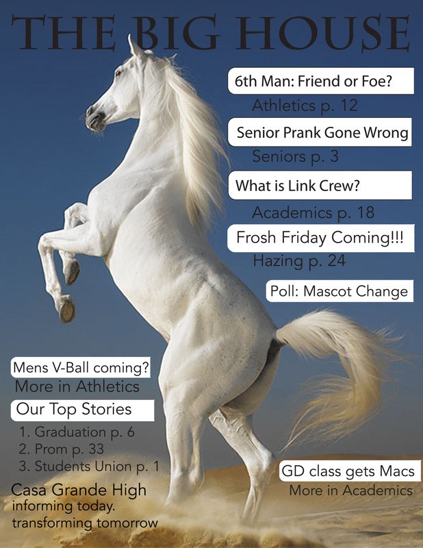
This is the magazine for the Big House. I put a horse on the cover even though we are the gauchos. We had to put in ten stories and I was able to do that by the way I put in "Our Top Stories". This project was fun to be a little more creative and I used both Illustrator and Photoshop. My favorite part was putting "The Big House" behind the horse. I just really like the way it looked. This is going to be one of the last projects that we use Illustrator and Photoshop for because we are about to start InDesign. It should be exciting.
Big House Magazine DPS
This project did not get difficult until the end. Working in InDesign was not hard but at the end when I had to switch over from InDesign to Photoshop it became really difficult. It took me a while but I just got a new iPad to put it on. I am not as frustrated as I was last class. It was actually pretty easy for me today. For this project we used the basics of InDesign and it was fun. I think InDesign is really cool I just hope it gets a little easier for me to upload these fun projects.
Stop Stealing Sheep Brochure

|
|
This is my brochure for the Stop Stealing Sheep notes. This project had a little bit more creativity involved than the previous projects. I took 15 of the notes to make up my brochure and a fun front cover with the title and sheep. This project was all done in InDesign. InDesign is much more advanced than Photoshop and especially Illustrator. I think my brochure turned out nice despite all of this.
