| On Friday, many students will be going to San Francisco to see some Keith Haring work. Haring was an interesting story by how he got to national prominence as you do not see artists reach that level of fame while they are still alive. He was raised in a typical middle class household in Pennsylvania but had so much to tell in his art. He related so well to young America that helped him garner fans. He got his start using chalk to create on blank subway ad spaces. Art that could have been sold for thousands of dollars he was getting arrested for. That is why I feel so many people, including myself, were so inspired by Keith Haring and his work. | 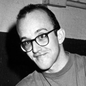 |
|
0 Comments
We had a guest speaker in class today and we learned about what we should do in our life and how to make good connections. It prepared us well for the real world and we learned how to shake hands properly. We did SWOT to figure our strengths and weaknesses. It was a great time.
1. Market Research: Do basic research on target demographic's needs and interests. 2. Budgeting: Write down your budget for the upcoming project and place in project folder. 3. Setting Goals: Set goals for sales and number of units. 4. Advertising Venue: Decide which media platform to display your ad and reach your target audience. 5. Choosing creatives: Find specialized workers to do small parts of the ad unless you are going to do everything by yourself. 6. Design and Wording: Review design, wording, and progress on your ad. 7. Placing the ad: Put the ad in the desired venue: make sure to check the ad before it goes public. 8. Evaluation: Analyze the effects of the ad. Look at sales before, during, and after the ad to have a gauge on how the ad did. There are 5 different types of logos. There is Symbol or Icon, Word Mark, Letter Mark, Combination Mark, and Emblem. Symbol or Icon: A logo with just a Symbol or Icon. Apple is the most recognizable Symbol in the world. Everybody has an Apple product on them on all times. Word Mark: A logo with just the name of the company as its logo. Google is a company that is known for this Word Mark design. Letter Mark: A logo that emphasizes the letter(s) in its logo. HP is an example of a letter mark logo. Combination Mark: A logo that is a word mark paired with a symbol. Many combination Marks become Symbols when they become more popular and recognizable. Think Sprint for this one. Emblem: Similar to a combination mark but their is a message in it. The NFL shield is a great example of an emblem because the shield has a greater meaning behind it. Helvitica is a very popular font that you can see on every street corner in America. It is very similar to arial as you can see in the image below but has its own unique style. It was created in 1957 by Swiss typeface designer Max Miedinger with help by Eduard Hoffmann. Helvetica is a modern Sans Seriff font. Some designers love Helvitica while others hate it, both statements can be portrayed in a helvitica font which is why it is so universal today. Helvitica is one of the great typefaces out there and can be used for any occasion. 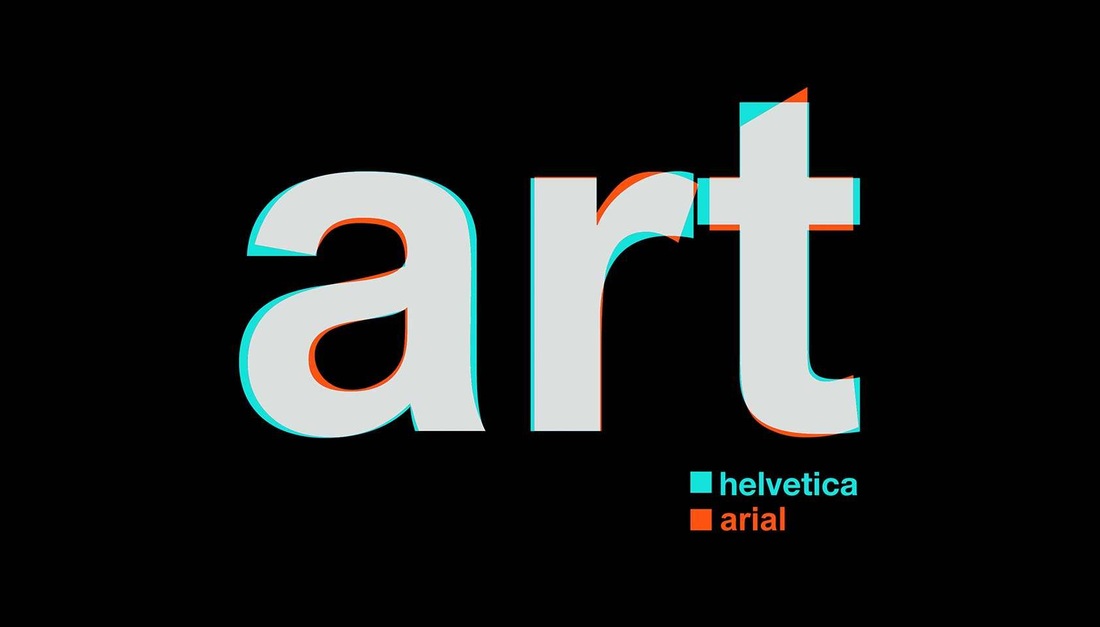
Milton is a very famous designer that lives and works in New York. He is the creator of the very popular I heart NY. Mr. Glaser made no money off of his most famous work because of his love for the city. Milton is not a typical designer but rather an old fashioned designer that does not put himself above anyone else. Milton is more than just a designer for New York, he is the voice of New York as well. Milton Glaser helped create New York magazine and is considered a great boss because of his unorthodox but highly effective methods such as having everyone in close quarters so there is no need for memos. He would also become the illustrator if the employees fell behind and were not going to make the deadline. Milton was a great designer because of everything he did for the industry and the city of New York. 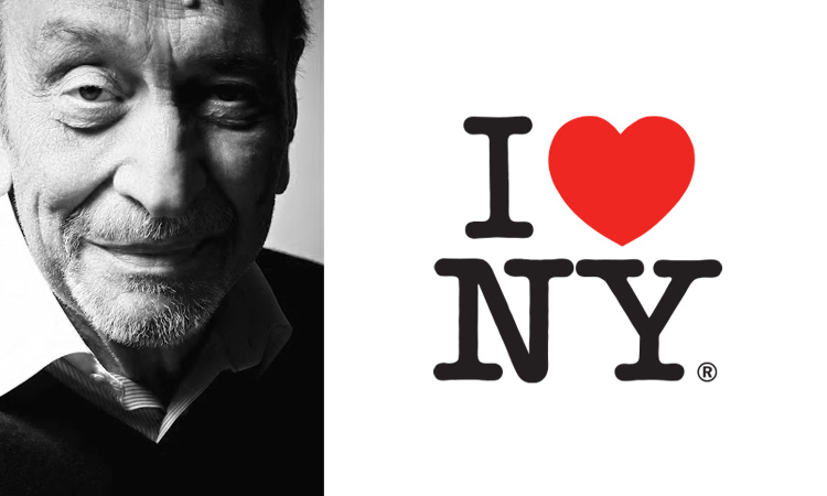 |
Archives
April 2015
Categories |

 RSS Feed
